First published on Thursday, August 13, 2020
Last updated on Tuesday, February 2, 2016
Designing a loveable logo
Traditionally marketers have always been really protective of the company logo, and rightly so as it is the one think that makes a brand instantly recognisable.
Although very important the logo is only a small element of a company’s brand and, in the era of social media and personalised content delivery platforms, it seems only natural that any forward looking brand would look to loosen their grip to make a company just that bit more lovable.
BrightHR are certainly forward looking so how were we going to make our brand more loveable?
We initially came up with the idea that everyone could have their own BrightHR logo. In this concept every user would have to write BrightHR when they signed up to use the software, this would be an element that would be unique to them and we would rotate through the different handwritten logos when people landed on the site.
A great first idea however, we quickly recognised that there were a number of flaws, not least because we’d have so many different logos designs on the go it could be hard to recognise us, but also that people might struggle to input the word using their mobile or mouse. So we knew the element would need to be very simple.
Getting personal
We always talk about the benefits of doodling — many of us have pens and pads, with some of us using technology to do the same. There have been countless scientific studies into why people doodle, how it benefits creative thinking and is a natural and often subconscious expression of the doodler’s mood. As a result some kind of hand drawn element seemed like a natural fit for what we were trying to achieve when we set out to incorporate a personalised feature.
We looked to other companies that had done similar things, reviewing the branding of organisations such as AirBnB, who allow users to modify the colours and design of their Bélo, but that didn’t seem to go far enough and we wanted people to connect more with what’s happening on screen.
Next we worked on the concept of having an asterisk with the logo, originally with the idea that this would link to another area on the website and information pages in order to have something that could easily be personalised — but then it hit us that this could be the personalised element.
The problem with the asterisk is that it didn’t really contribute to the design of the logo, we also didn’t feel as though it was something that could be owned by BrightHR. So, after lots of coffee, discussion and many hours of doodling ‘The Xing’ was born.
The Xing is a thing
‘The Xing’ is the mark that often (but not always) appears before the BrightHR logo.
The Xing has a number of meanings. It’s a ‘b’ for Bright; it has 5 arms which represent the 5 guiding principles of BrightHR’s brand and culture (fun, simplicity, courage, zest and love); it’s the spark of Brilliance.
Everyone who we showed this to had the same reaction and felt we’d manage to capture the brand in a mark — people always smiled when they saw it — so we knew we were onto something that had the ability to positively impact people’s moods.
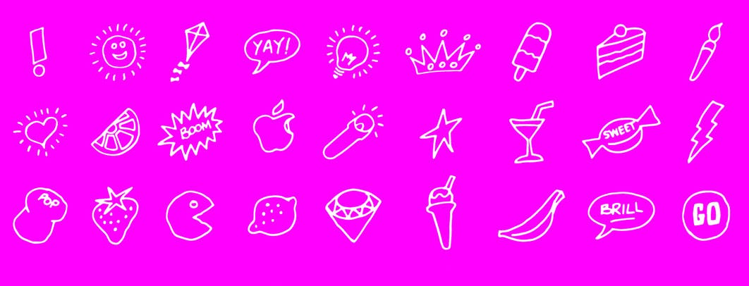
We started to develop the Xing as a doodle to suit your mood, this quickly became a Moodle.
Moodle your doodle
Crucially a Moodle is a really simple shape that anyone can draw. Great for personalising and anyone can do it.
This got us thinking about encouraging people to have their own Moodle, and why not let people change the Moodle’s that appear in the software that they use every day?
Following the birth of the Moodle we went on to develop a ‘Moodle Bar’ which allows BrightHR users to choose the one that best suits their current mood and, in the future, we plan to introduce an upload feature so users can create, upload and use their own Moodles to personalise their dashboards even further. Brilliant or what?!
Doodles, and now Moodles, can say a lot about you. So what are you waiting for? Get Moodling!


